0 Comments
 Throughout andy Goldsworthy's work, his non-destructive creations invoke similar themes. Manipulating nature to form recognizable structures without tools results in patterns like stacking, condensed versus uncontrolled subjects, and order compared to disorder.
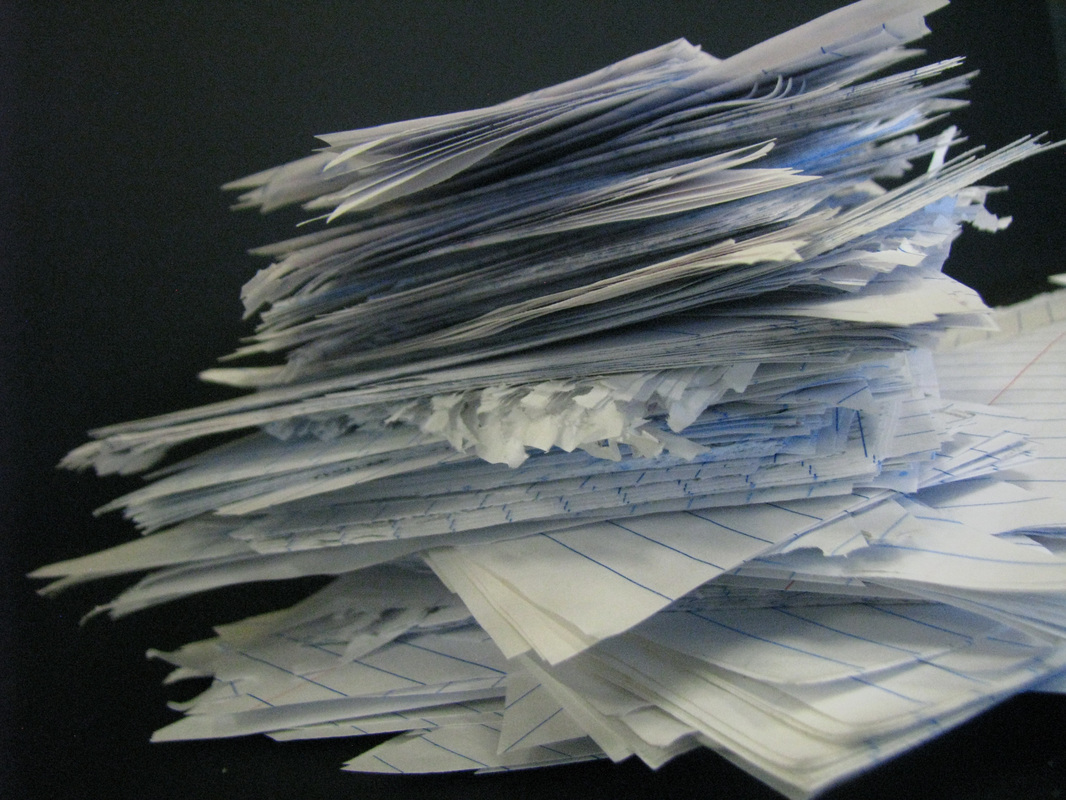
I was particularly inspired by the look of stacked repetition and vague yet obvious forms. The piece I made involved cutting triangles of paper and staking them to form a likeness of a tower. The actual shape can be interpreted in various ways, and the relationship between the shape and the material itself encourages thought on the behalf of the audience. However, unlike Andy Goldsworthy, the piece does not fit in or stand out from the surrounding environment. I chose instead to photograph it against solid black, emphasizing the structure itself but also taking away meaning from the material, as there is no context with which to compare. I also chose to create a photo on a smaller scale, which resulted i fewer details to include. A lot of the self portraits I looked at for inspiration had little detail except in the face. I tried to emulate this with my lighting and neutral color scheme. I think this draws emphasis to the actual facial expression and composition's details. It's simplistic focus reveals every aspect of the straight forward subject . This way, the audience can interpret a relatively unedited version of "the truth." They aren't given too much information to confuse them or bias their view, But at the same time they can look straight at the details of the person to figure out for themselves who the person is based on their self portrait. 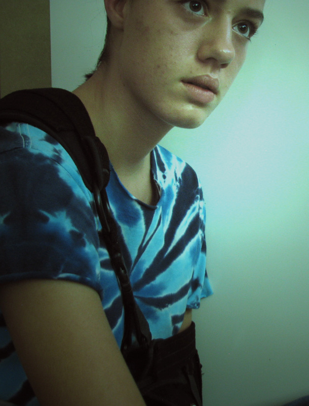 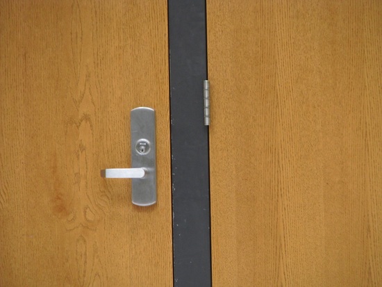 To find the worst possible scenario to photograph, I figured I would seek out the opposite of what I might normally photograph. This required remaining indoors. Similarly, I set the functions on my camera to accommodate the opposite circumstances of the image. For this image, I set it to "cloudy", "vivid green", and a "evaluative" focus. I also decided to have no background and very little foreground, resulting in a nondescript middle ground as the subject. The lighting does not direct the view to any specific subject and there is no framing. I also generally find asymmetry in art to be aesthetically pleasing; this photograph is nearly perfectly symmetrical. In this way, I developed every aspect of "bad" photography in one image.
|
AuthorWrite something about yourself. No need to be fancy, just an overview. Archives
December 2016
Categories |

 RSS Feed
