|
Topic: I plan on shooting photos around a central theme of new perspectives, which consists of both physical perspectives as well as subject irony and diversity in subject material and composition; I hope to incite humor and insight in my work.
Photo Shoot Plans: 1. Technology misplaced in nature 2. every day objects with alternate lighting 3. unusual monochromatic situations 4. portraits: skewed perspective of only part of body 5. portrait: action shots and additive subject material (water, sparkles, etc) 6. irony with size (Tower of Pizza effect) 7. cultural portraiture- candid and in natural setting to show unique perspective of identity 8. wide angles of average objects 9. reflections Padlet URL: https://padlet.com/wall/5oo98wszpgoz
0 Comments
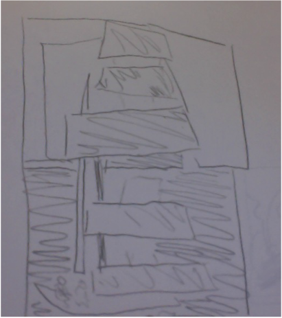 In this piece, an image of a sailboat, water, and the horizon has been cut up and formed into a three dimensional re-imagination. the horizontal colorful strips of the sail have been a hot-glued to the ends of tubes of paper which stand perpendicular to the plane of the image; the same has been done with pieces of the sky. This makes it so that the entire image cannot be seen all at once unless viewed from a single perspective directly in front of the piece. I used shape to convey the importance of perspective. By cutting out the specific forms of positive and negative space created by the sailboat, horizon, and ropes, I showed a clear delineation of shapes in the piece. By subsequently raising these pieces to varying heights above the plane, I show the importance of perspective. The entire context of the picture only aligns when the viewer stands directly in front of the piece. Like a puzzle, the different pieces only fit together from one perspective, giving a new dynamic to the concept of viewing flat images. I like to think that the undulating levels of the pieces of sail suggest the presence of wind and movement. The raised chunks of sky also suggests how the "sky" seems more present in the windy setting of a sailboat while the water, remaining on the lowest level of the piece, seems out of reach. By generating the demand of a single perspective, I almost force the audience to view the image in the same way I see it. However, I also communicate the necessity of understanding differences in perspective. It is considerably difficult to see each and every component of a situation at once, even in something as seemingly straightforward as sailing, which I feel I conveyed in this piece. Overall, this piece ended up fitting my original goal. I think I could have fit the individual components together in a more organized manner, as the sail and the sky are not quite aligned. I didn't have time to properly mat the piece, which gives it a sloppy finish. I also could have made the tubes of paper raising the image pieces more inconspicuous and uniform by painting them the same color as the mat board. However, I think it conveys my idea nicely and is fairly neat, concise, and aesthetically coherent. 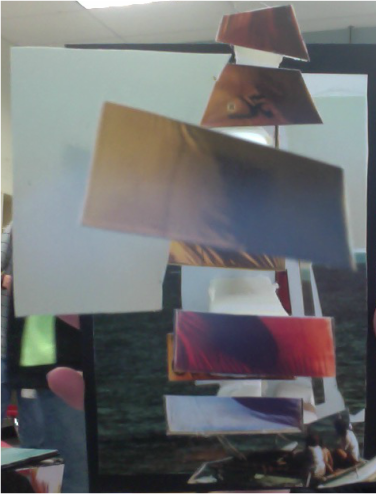
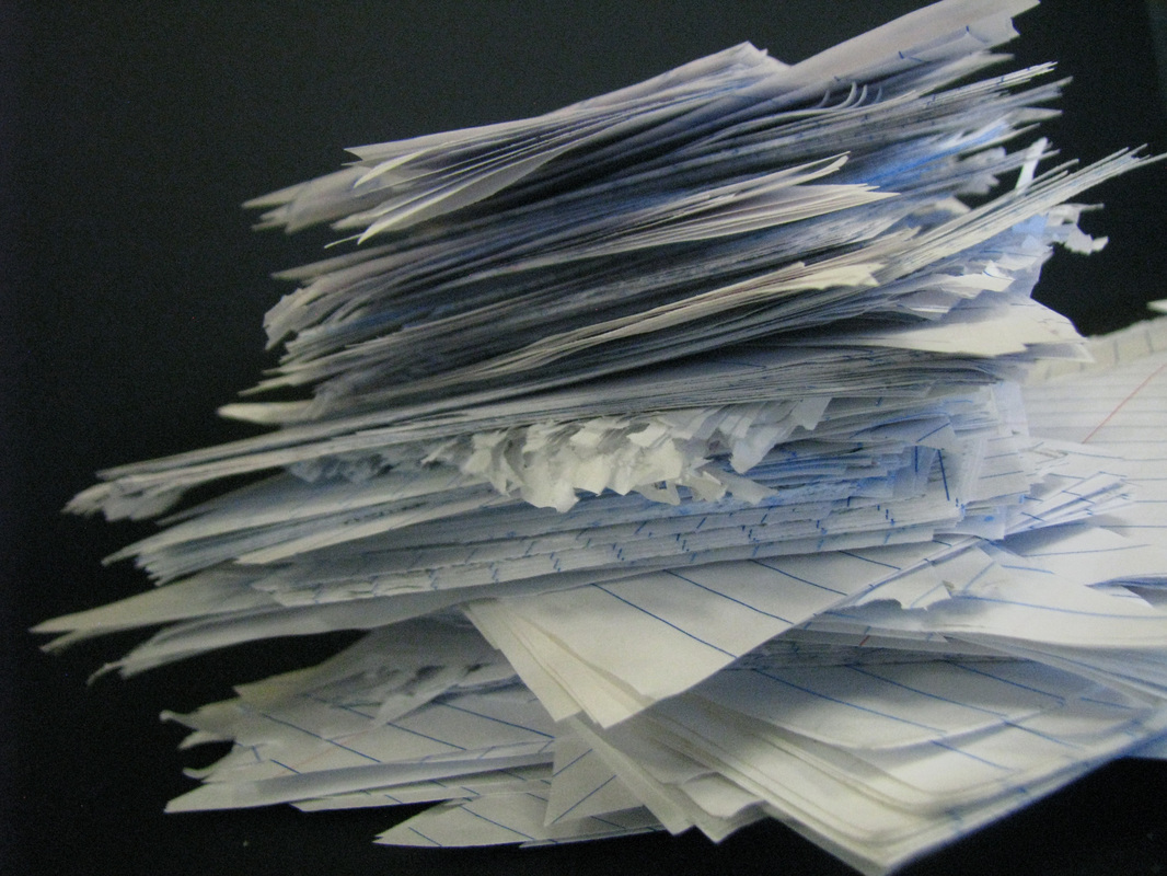 Throughout andy Goldsworthy's work, his non-destructive creations invoke similar themes. Manipulating nature to form recognizable structures without tools results in patterns like stacking, condensed versus uncontrolled subjects, and order compared to disorder.
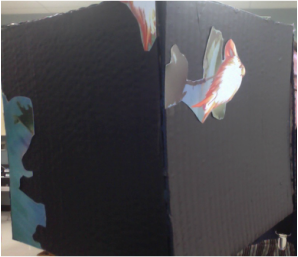
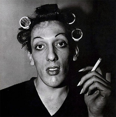
I was particularly inspired by the look of stacked repetition and vague yet obvious forms. The piece I made involved cutting triangles of paper and staking them to form a likeness of a tower. The actual shape can be interpreted in various ways, and the relationship between the shape and the material itself encourages thought on the behalf of the audience. However, unlike Andy Goldsworthy, the piece does not fit in or stand out from the surrounding environment. I chose instead to photograph it against solid black, emphasizing the structure itself but also taking away meaning from the material, as there is no context with which to compare. I also chose to create a photo on a smaller scale, which resulted i fewer details to include. A lot of the self portraits I looked at for inspiration had little detail except in the face. I tried to emulate this with my lighting and neutral color scheme. I think this draws emphasis to the actual facial expression and composition's details. It's simplistic focus reveals every aspect of the straight forward subject . This way, the audience can interpret a relatively unedited version of "the truth." They aren't given too much information to confuse them or bias their view, But at the same time they can look straight at the details of the person to figure out for themselves who the person is based on their self portrait. 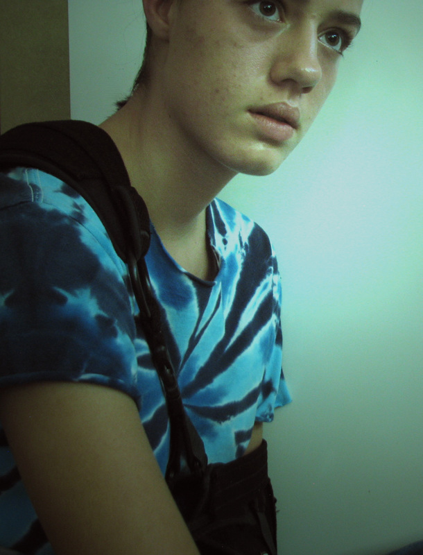  To find the worst possible scenario to photograph, I figured I would seek out the opposite of what I might normally photograph. This required remaining indoors. Similarly, I set the functions on my camera to accommodate the opposite circumstances of the image. For this image, I set it to "cloudy", "vivid green", and a "evaluative" focus. I also decided to have no background and very little foreground, resulting in a nondescript middle ground as the subject. The lighting does not direct the view to any specific subject and there is no framing. I also generally find asymmetry in art to be aesthetically pleasing; this photograph is nearly perfectly symmetrical. In this way, I developed every aspect of "bad" photography in one image.
|
AuthorWrite something about yourself. No need to be fancy, just an overview. Archives
December 2016
Categories |

 RSS Feed
