|
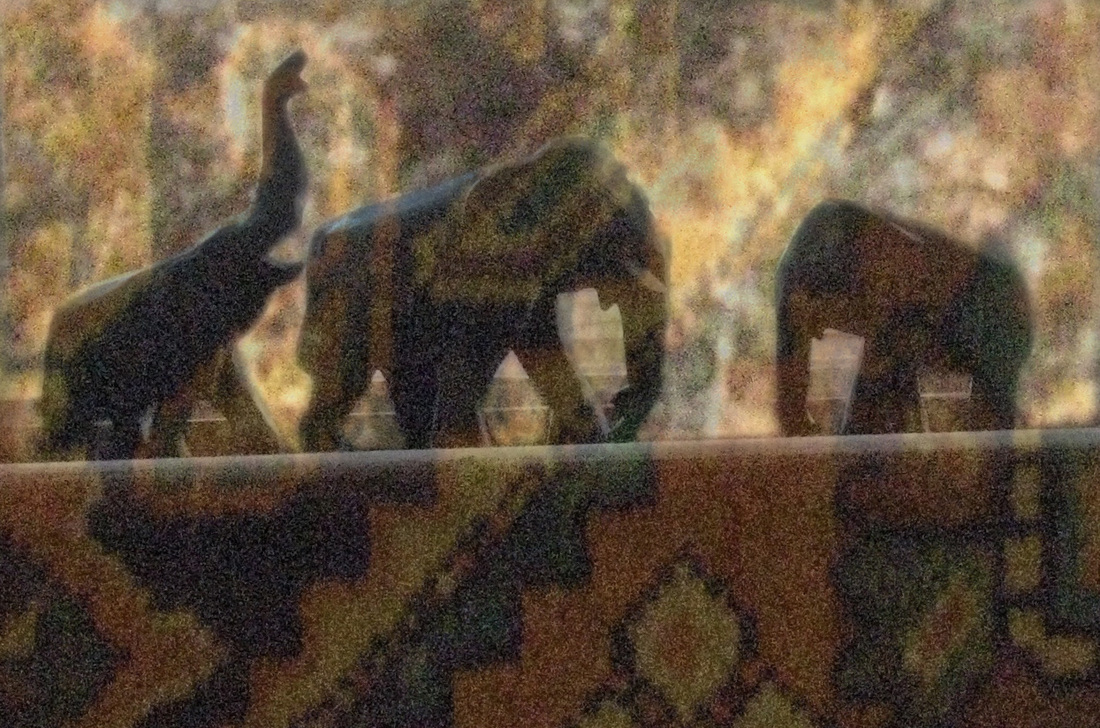
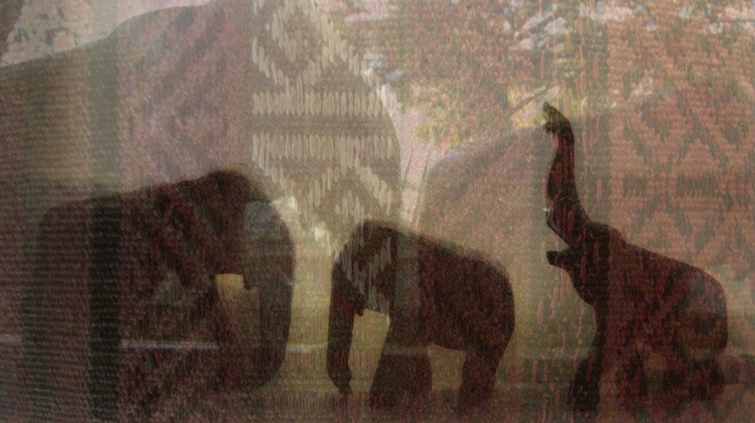
This piece used a picture of elephant figurines lined up on a windowsill and layers of images of patterned carpets. The first image shows a small elephant with its trunk up following a larger elephant facing right while another smaller elephant faces the other two. A yellow, blue, and black geometric pattern is laid over (in photoshop) the elephants and is most visible on the windowsill, which horizontally divides the image about half way up. The second image shows the two smaller elephants facing the large one on the left. They are positioned lower down and another lighter image of the elephants is overlaid in the image and takes up the entire space. A zig-zag carpet texture with white, red, and black is overlaid on these images. The two pieces are matted side by side and each image is placed at an angle in the frame.
I think the use of value helped me enforce a sense of pattern. I found that in photo shop, depending on what layer is on top and what the opacities of each layer is, the images turn out differently. I put the elephant layers on top then slightly lowered their opacity while the texture layers were underneath and completely opaque. This made the texture and patterns show through only in the darkest part of the elephant images. I thought this was a really interesting technique and was invaluable when working with such repeating, intricate patterns and simple images of elephant figurines. You can see that the patterns are most evident where the values in the elephant images are darkest, such as the windowsill and the figurines themselves. I think that the use of layers really helped me achieve my goal of conveying "different perspectives." It's hard to tell which image is more important: the elephants or the carpet design. I like how they meld together to make one image but the viewer can also try to interpret them separately. By matting the two pieces together, I am also able to emphasize the importance of different perspectives in multiple situations. The conundrum of interlacing images does not just arise in one photo, but can be readily seen throughout life. I think I could have made this piece better by using different images other than elephant figurines. I think that using other toys, like rubber ducks, would have contributed more to the humorous idea. However, I was surprised by how well the layering worked out and I think that the compositions itself was successful, especially the image with two layers of elephants. I think that a lot of people will also like this, because it is generally simple and aesthetically pleasing, not to mention intellectually intriguing.
0 Comments
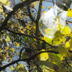 This being my first photo edited in open studio, I think it turned out pretty well. I used multi-media by matting it on a piece of wood. I like the photo itself because it has a busy yet continuous background. I like the confined color scheme as well as the intersecting, diagonal branches. The composition works because the subject is offset from the center of the square. I think I succeeded in my idea of irony because the lightbulb seems to be growing from the branch. Moreover, by matting it on wood, it draws emphasis on the forest setting, reiterating the misplacement of the subject. I think I could have edited it better, with more contrast and saturation, in order to use printer paper and transfer the ink onto wood. Because I didn't do this, the end result is kind of fuzzy. I think I would also be more successful with indoor settings as the lighting is hard to control. I hope to do a similar thing as this photo in the future by purposely devising microcosmic ironies. However, this subject is pretty generic and I hope to focus in on more obvious, specific topics for the rest of my portfolio.
|
AuthorWrite something about yourself. No need to be fancy, just an overview. Archives
December 2016
Categories |
 RSS Feed
