|
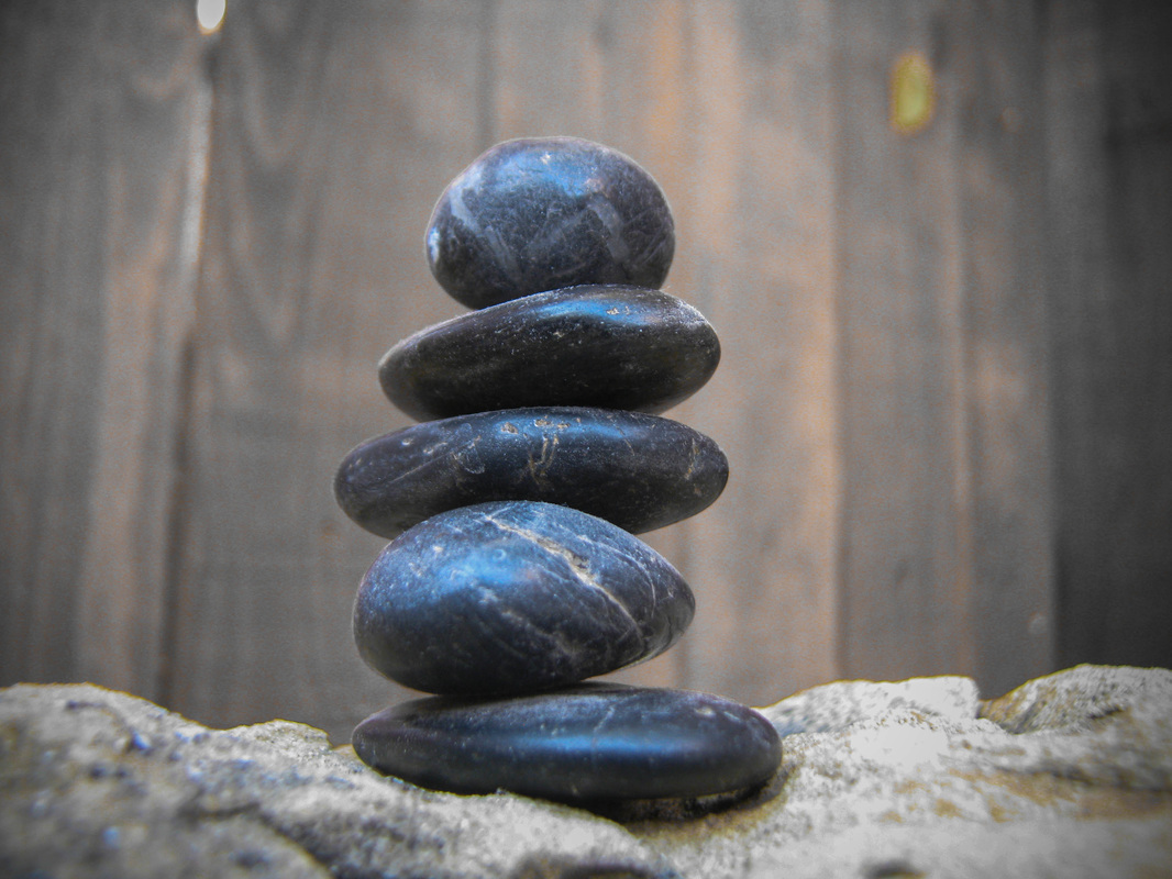
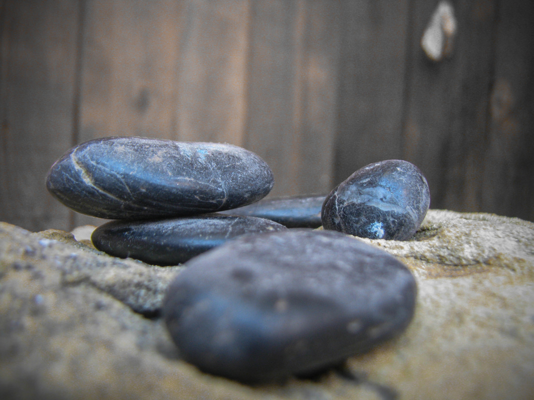
For this project I tried to showcase the abstract concept of time and progress. I printed these three images on large glossy paper then plastered them on to a cylinder This encourages the question of whether the stack is being raised or razed. I really like how the images themselves turned out. They are very in focus, although I'm not sure how much I like how the subject is very centered. I like how the blue sky is reflected in the polished stone, but overall the image is rather colorless. Maybe I should have increased the saturation of the blue to emphasize its color. Even though the subject material is very centered, it is not completely symmetrical and it is sort of necessary to capture the entire object, so I think it worked out as well as it could have. It was pretty difficult to make the cylinder itself on which I matted these images, but I like how it is both large and 3-d. Overall, this was a fun piece to make and I think it was very successful in communicating my intended question of perspective.
0 Comments
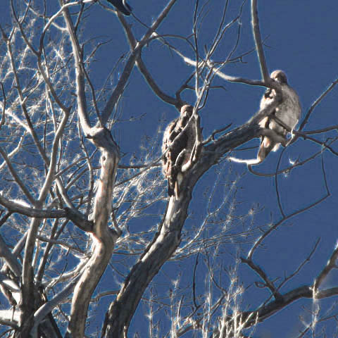
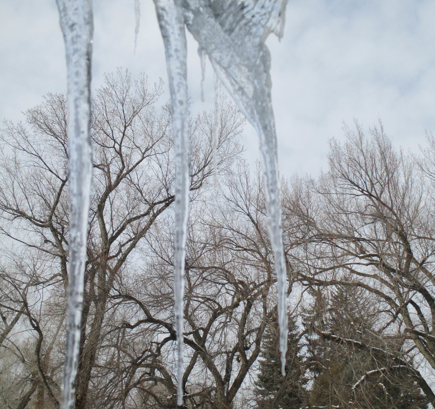
I made this piece with two different photos of the same trees in my neighbor's yard. The first one I took in the summer and it is closer up to show the vultures roosting in the top branches. The second photo was taken a year earlier in the winter from my porch with icicles. I edited the vulture photo to make the contrast higher and the background darker to emulate some black and white photographs I had seen that seemed almost like infra-red images. I then printed the icicle image on clear paper and the vulture paper on smaller matt paper. I framed the larger piece and created a box to set the smaller piece in the back. This makes it so you have to look through the trees to see the roosting vultures.
I tried to make the set-up seem like a cheesy exhibit at a museum. The dark background and accentuated highlights makes the vultures seem hyper-realistic while the dead trees give the suggestion of an artificial setting that someone intentionally set up to provide the vultures context. I really like the contrast and I think that the branch texture unifies the piece very well. It is clear that the setting is continuous. I think the end product communicates my idea very well. It is evidently ironic that people try to exhibit things in their so-called "natural habitat" which ends up making the entire experience artificial. While the subject itself is very interesting, the presentation can cloud the viewers perception. I think I could have made the vulture image a bit lighter because right now it is difficult to see very well within the box. I also think it would have been cool to over-edit the front tree image, such as making it hyper-saturated and unnatural colors. The viewing box I made turned out better than I thought it would. I'm pleasantly surprised that my last photo shoot didn't go well or I wouldn't have looked back through my photos to find these.  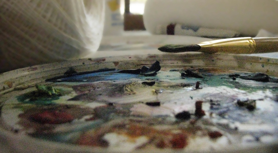 I took this photo of my table after I had been watercolor painting before I had cleaned up. In the foreground is my palette of mixed pigments. A paint brush angles in from the right and rests on the rim of the palette. Behind that there is a roll of twine on the left and roll of paper towel and a tube of paint on the right. In the center at the top, framed by the paper towel and twine, is a square of light coming in from the window illuminating the scene. The background is mostly white and blurry (an affect of photoshop) and the bottom quarter of the page- which is part of the palette- is also blurry and darker. The edges of the images are vignetted (in lightroom) to be darker. I framed it with the white, penciled side of a mattboard.
The use of texture in this piece helped me emphasize the unity of the piece. There are a lot of subjects- the palette, paintbrush, tube of paint, twine, etc. - so the focus of the image is difficult to interpret on its own. The original image was blurry at the bottom because I was focusing on the blue paint. By using photoshop to make the background a similar burry texture as the closest foreground I unified the piece. It is now clear that the focus is toward the center of the image and the paintbrush because those are the clearest parts of the image. The top and bottom of the piece have the same texture which makes it easier to group the different objects together in one idea. The original intention of this piece was to show what life is like in the absence of people. I hoped to communicate a sense of "recently departed" in showing how humans leave their mark on the world and how the world is stagnant (or in motion) when they are gone. I think I succeeded in this pursuit. The vignetting especially shows a shadow-y effect that makes it seem more stagnant. The image itself is obviously dependent on human action but at the same time is also obviously abandoned. I like this piece a lot more than I though I originally would. The mixed pigments and affects of the natural light makes the artificial scene very natural and elegant. I've always wanted to take a partially-blurry picture, but they never turn out as well as this one did. The frame looks like it was meant to be a mistake but is also elegant in itself and shows the lasting affect of humans. I did this because the plain was too bright and the plain black was too dark, and I like the final look. I think I targeted my theme of different perspectives very well in showing the perspective of life without humans. That which is left behind is beautiful too, and I think this photo works well to show that. |
AuthorWrite something about yourself. No need to be fancy, just an overview. Archives
December 2016
Categories |

 RSS Feed
